
Blogs
5 home office paint colors: Focused & functional palettes
The home office is no longer just a spare room; for many, it's a vital hub for productivity, creativity, and focus. The right paint color can significantly impact your mood, concentration, and overall work experience. Masterpiece Painter understands the importance of a well-designed workspace. Here's a guide to selecting home office paint colors that are both productive and stylish, helping you create an environment where ideas flourish and tasks get done.
Focus-friendly neutrals: Greys, soft whites
Neutrals are a classic choice for home offices because they provide a calm, unobtrusive backdrop that minimizes distractions, allowing your mind to focus on tasks.
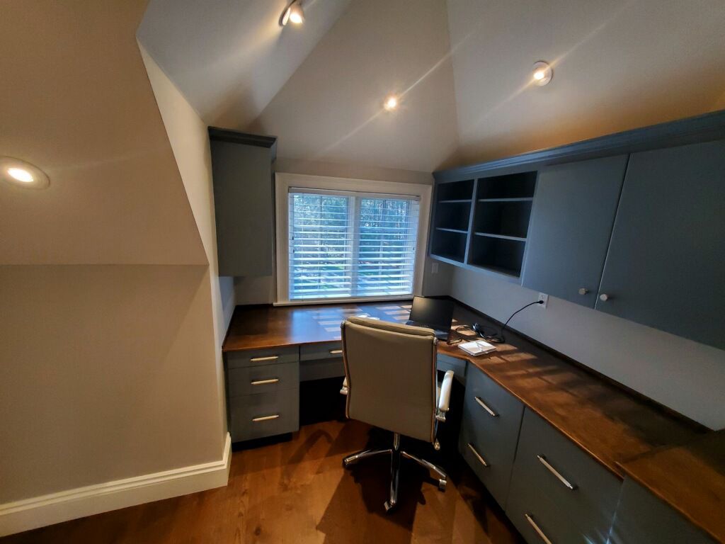
Grays: Ranging from light, airy silvers to deep, grounding charcoals, grays offer sophistication without being overwhelming.
Light Grays: Promote a spacious, contemporary feel. They're excellent for smaller offices as they reflect light, making the room feel larger and brighter.
Mid-Tone Grays: Provide a balanced, professional backdrop. They offer more depth than light grays without making the room feel heavy.
Warm Grays (Greige): If your office lacks natural light or feels cold, a gray with subtle beige or taupe undertones can add warmth and comfort, creating a more inviting atmosphere.
Soft Whites: Far from stark, soft whites (like off-whites, creamy whites, or those with very subtle undertones of gray or beige) are ideal for creating a bright, clean, and minimalist workspace.
Benefits: They maximize natural light, making the room feel open and expansive. They also serve as a perfect canvas for colorful artwork, office accessories, or rich wood furniture.
Considerations: Ensure the white isn't too stark, as a very cool white can feel clinical. Look for whites with a touch of warmth to keep the space inviting.
Neutrals are incredibly versatile, allowing you to easily update your decor or rearrange your workspace without needing a complete repaint.
Accent color psychology: Blues for calm, greens for creativity
While neutrals provide the foundation, strategic use of accent colors can tap into color psychology to enhance specific aspects of your workday.
Blues for Calm & Focus:
Psychology: Blue is widely associated with stability, tranquility, and concentration. Lighter blues can be serene and promote clear thinking, while deeper blues can evoke a sense of trust and professionalism.
Application: Ideal for a home office where focus and analytical work are primary. Consider a muted navy for an accent wall or a soft sky blue for all walls to create a peaceful environment.
Greens for Creativity & Balance:
Psychology: Green is linked to nature, growth, and harmony. It's known to reduce eye strain, promote a sense of balance, and stimulate creativity.
Application: Excellent for designers, writers, artists, or anyone whose work requires innovative thinking. A muted sage green can be very calming and inspiring, while a vibrant but not overwhelming emerald can add energy.
Other Considerations:
Yellows (Muted): Can inspire optimism and energy, but use sparingly and in muted tones to avoid overstimulation.
Soft Purples/Lavenders: Can encourage introspection and problem-solving.
Use these accent colors strategically on an accent wall, in recessed niches, or through decor to harness their psychological benefits without overwhelming the workspace.
Accent walls or masked study nooks
Accent walls and clever masking techniques can define zones within your home office, adding style and helping delineate functions.
Accent Walls:
Focal Point: Painting one wall a different color (often the wall behind your desk or a prominent feature wall) creates a focal point, adding depth and visual interest to the room.
Color Pop: Use an accent wall to introduce a calming blue, a stimulating green, or a sophisticated charcoal against softer neutral main walls.
Behind the Desk: An accent wall behind your desk can help define your primary workspace and provide a stimulating or calming backdrop for video calls.
Masked Study Nooks/Zoning:
Define Areas: In a multi-purpose room or a larger open-plan space, use paint to visually separate a specific study area. Paint the wall within a recessed nook or a section of a wall in a contrasting or complementary color.
Built-in Look: Paint the back of a bookshelf or built-in desk unit an accent color to make it pop and feel more intentional.
Ceiling Integration: Extend the accent wall color slightly onto the ceiling above the study nook to create a more enclosed, focused feel.
These techniques allow you to experiment with bolder colors without committing to them throughout the entire room, offering flexibility and dynamic design.
Finish: Satin finish for cleanability
The paint finish is important for both aesthetics and practicality in a home office.
Satin Finish:
Recommended Use: Ideal for home office walls.
Benefits: Offers a subtle, soft sheen that is more durable and significantly easier to clean than matte or flat finishes. This is crucial for an active workspace where scuffs, marks, or dust might accumulate. It can be wiped down with a damp cloth without damaging the finish.
Aesthetics: Satin reflects a small amount of light, which can make colors appear slightly richer and add a touch of sophistication without being overly glossy or reflective, which could cause glare or distractions.
Considerations for Other Finishes:
Matte/Flat: While creating a very sophisticated, non-reflective look, they are less durable and harder to clean. Best for very low-traffic areas or ceilings.
Semi-Gloss/High-Gloss: Too reflective for main walls in a home office, potentially causing glare and distractions. Best reserved for trim, doors, or furniture.
Lighting complement & décor synergy
The right lighting and decor enhance your chosen paint colors and contribute to overall productivity and style.
Lighting Complement:
Natural Light: Assess how natural light enters your office throughout the day. Light colors maximize natural light, while darker colors absorb it, creating a cozier feel.
Layered Lighting: Combine ambient (overhead), task (desk lamp, floor lamp), and accent lighting to control the mood and functionality.
Bulb Temperature: For a home office, a neutral white light (around 3500K-4000K) is often preferred for alertness and clarity, avoiding the overly warm (yellowish) or overly cool (bluish) tones.
Décor Synergy:
Furniture: Choose furniture that complements your wall colors. Light woods and white furniture pop against darker walls, while dark woods and metals provide contrast against lighter walls.
Artwork: Use artwork to introduce complementary or contrasting colors, adding personality and inspiration without repainting.
Textiles: Incorporate textures and patterns through rugs, curtains, and throw pillows that work with your color palette, adding comfort and sound absorption.
Greenery: Live plants add a touch of nature, improve air quality, and introduce natural greens that can be calming and inspiring.
Mood & productivity test samples
The most crucial step in choosing paint colors is to test them in your actual space.
Purchase Samples: Buy small sample pots of your top color choices.
Paint Swatches: Paint large swatches (at least 2x2 feet) on several different walls in your home office.
Include walls that receive varying amounts of natural light throughout the day.
If considering an accent wall, paint a swatch there as well.
Observe at Different Times: Observe how the colors look throughout the day, in morning light, afternoon light, and under your artificial lighting (both on and off).
Consider Furniture & Existing Elements: Place existing furniture, flooring samples, or decor items near the swatches to see how they interact with the paint color.
Reflect on Mood: As you work or spend time in the room, pay attention to how each color makes you feel. Does it inspire focus, calm, creativity, or distraction? This subjective test is as important as the visual one.
Taking the time for this testing phase can prevent costly mistakes and ensure you select the perfect color that enhances both your productivity and your personal style.
Ready to transform your home office into a space that inspires and motivates? Masterpiece Painter specializes in creating productive and stylish environments with expert color consultation and flawless application. Our team ensures a beautiful, lasting finish that elevates your home workspace. Contact us today for a consultation and let us help you paint your path to productivity!

About Masterpiece Painter
For over 17 years Masterpiece Painter, has been serving communities all around New England. Let us help you make your wishes come true by turning your property into a Masterpiece
Get a Quote
Contact Us


© copyright 2023 All Rights Reserved.