
Blogs
Roof and siding colors combination: Exterior Paint Pairings
Achieving a high-end exterior aesthetic isn't about choosing the most expensive paint; it is about visual harmony. A cohesive exterior uses the roof as an "anchor" for the rest of the home’s palette. When the roof and siding work together, the home looks intentional, expensive, and architecturally sound.
Quick Answer: Match Undertones, Then Choose Contrast Level
The "secret" used by professional designers is color temperature. Every material, from asphalt shingles to vinyl or cedar siding, has a hidden undertone—usually blue, green, violet (cool) or yellow, orange, red (warm).
Warm roof → warm siding/trim
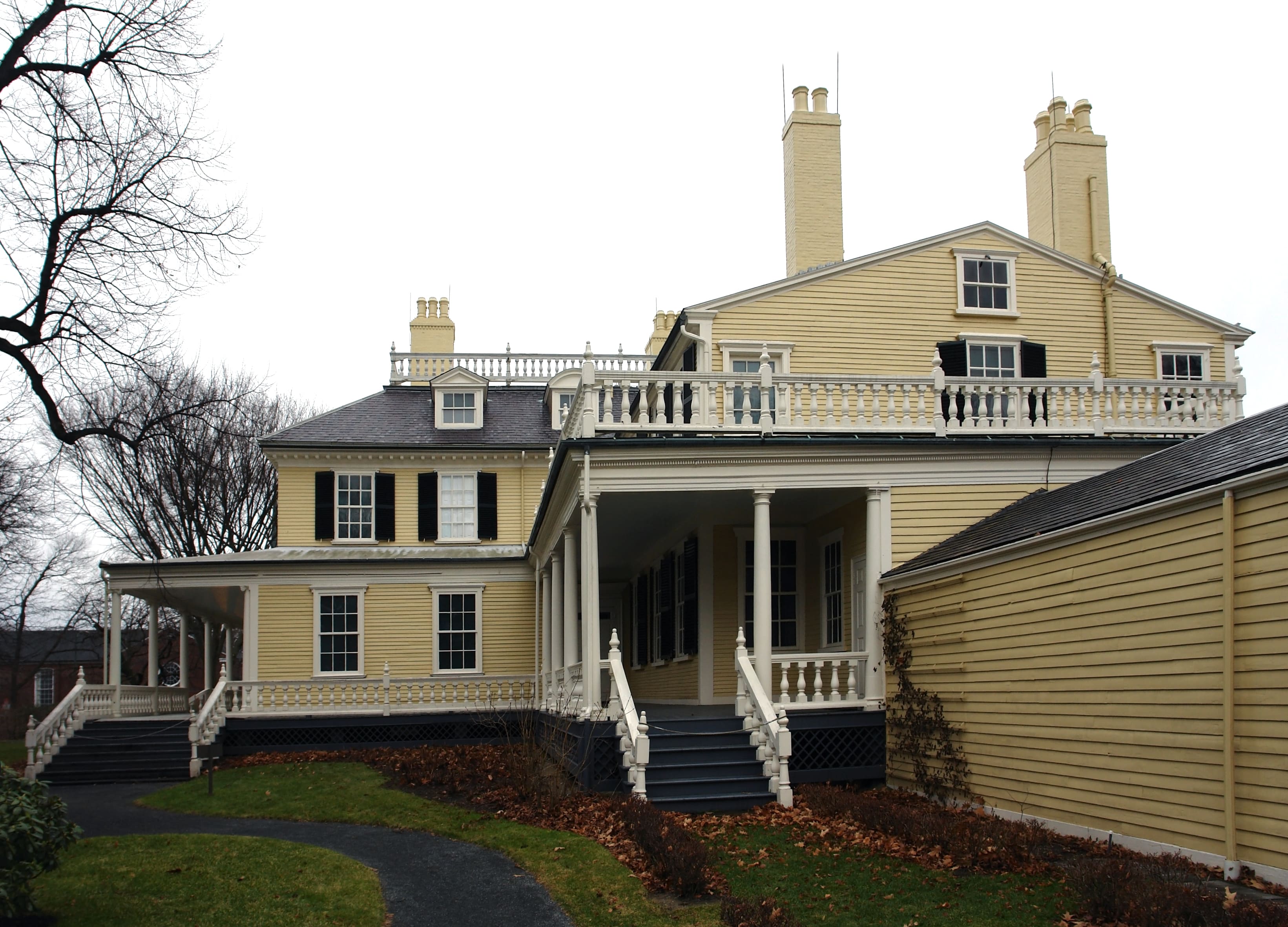
If your roof has brown, tan, or reddish-gold tones, your siding should lean into the "warm" family. Think creams, tans, earthy beiges, or warm wood stains.
Cool roof → cool siding/trim
Charcoal, slate gray, and blue-toned roofs pair best with "cool" siding. This includes crisp whites, true grays, navy blues, and sage greens.
10 Popular House + Roof Color Combinations
White siding + dark roof (classic contrast)
This is the "Modern Farmhouse" staple. A high-contrast look (Bright White siding with Black or Charcoal shingles) creates a sharp, clean silhouette that looks premium in any light.
Greige siding + charcoal roof
Greige (a mix of gray and beige) is the most popular high-end neutral. It offers the sophistication of gray without the "cold" feeling, especially when grounded by a dark gray roof.
Navy siding + white trim + dark roof
Deep navy is a bold, "statement" color. Pairing it with a dark roof keeps the house from looking top-heavy, while white trim adds the "pop" necessary to define architectural lines.
Sage green siding + brown/charcoal roof
Sage green is an "organic" neutral. When paired with a brown roof, it feels rustic and nested in nature; with a charcoal roof, it looks modern and refined.
Trim and Accent Colors: The “30-60-10” Approach
To keep a home from looking cluttered, designers use the 30-60-10 Rule:
60% (Main Siding): Your primary color.
30% (Secondary/Trim): Your roof and trim color (soffits, window casings, gutters).
10% (Accent): The "jewelry" of the house.
Where to use accent color (door, shutters)
The 10% accent should be reserved for your front door and shutters. This is where you can take a risk with a bold red, a deep forest green, or a sophisticated black to draw the eye to the entrance.
Choosing Colors for New England Homes (MA)
Massachusetts homes face unique environmental and historical challenges that dictate specific color choices.
Light + salt + weather considerations
In coastal areas like the North Shore or Cape Cod, the "salt air" can cause certain pigments to fade faster. Light colors are highly recommended here as they hide salt spray residue and reflect the intense summer sun. Furthermore, New England’s "gray" winters mean that overly cool grays can make a house look dreary; adding a touch of warmth to your gray ensures it looks "inviting" even in February.
Historic neighborhoods and style alignment
Whether you are in a Lexington Colonial or a Boston Brownstone, local history matters. Many Massachusetts townships have historic commissions that favor "heritage" palettes—muted ochres, deep reds, and slate grays. Aligning with these traditional colors ensures your home maintains its market value and curb appeal within the community.
FAQs
What exterior color combos increase curb appeal?
Neutral palettes with a high-contrast front door (e.g., Light Gray siding, White trim, Navy door) consistently rank highest for resale value. They appeal to the widest range of buyers while still feeling "custom."
Should the roof be darker than siding?
Generally, yes. A darker roof "grounds" the house and makes the siding colors pop. While some modern designs use light-colored metal roofs for energy efficiency, the traditional "high-end" look typically features a roof that is several shades darker than the walls.
What’s the safest trim color?
Off-white or "Soft White" is the safest choice. Pure "stark" white can look like plastic in direct sunlight, whereas a slightly creamier white looks more expensive and pairs well with almost any siding color.
Transform Your Home with Masterpiece Painter
Choosing the right color combination is a major investment in your property's future. At Masterpiece Painter, we don't just apply paint; we help you curate a vision. Our experts understand the nuances of New England light and the specific architectural styles of Massachusetts. We use premium, weather-resistant coatings designed to withstand our local climate while providing that high-end, "just-painted" look for years to come.
Ready to elevate your home’s curb appeal? Contact Masterpiece Painter today for a professional color consultation and a flawless execution!

About Masterpiece Painter
For over 17 years Masterpiece Painter, has been serving communities all around New England. Let us help you make your wishes come true by turning your property into a Masterpiece
Get a Quote
Contact Us


© copyright 2023 All Rights Reserved.