
Blogs
Most Popular Light Gray Interior Paint [Top Shades 2025]
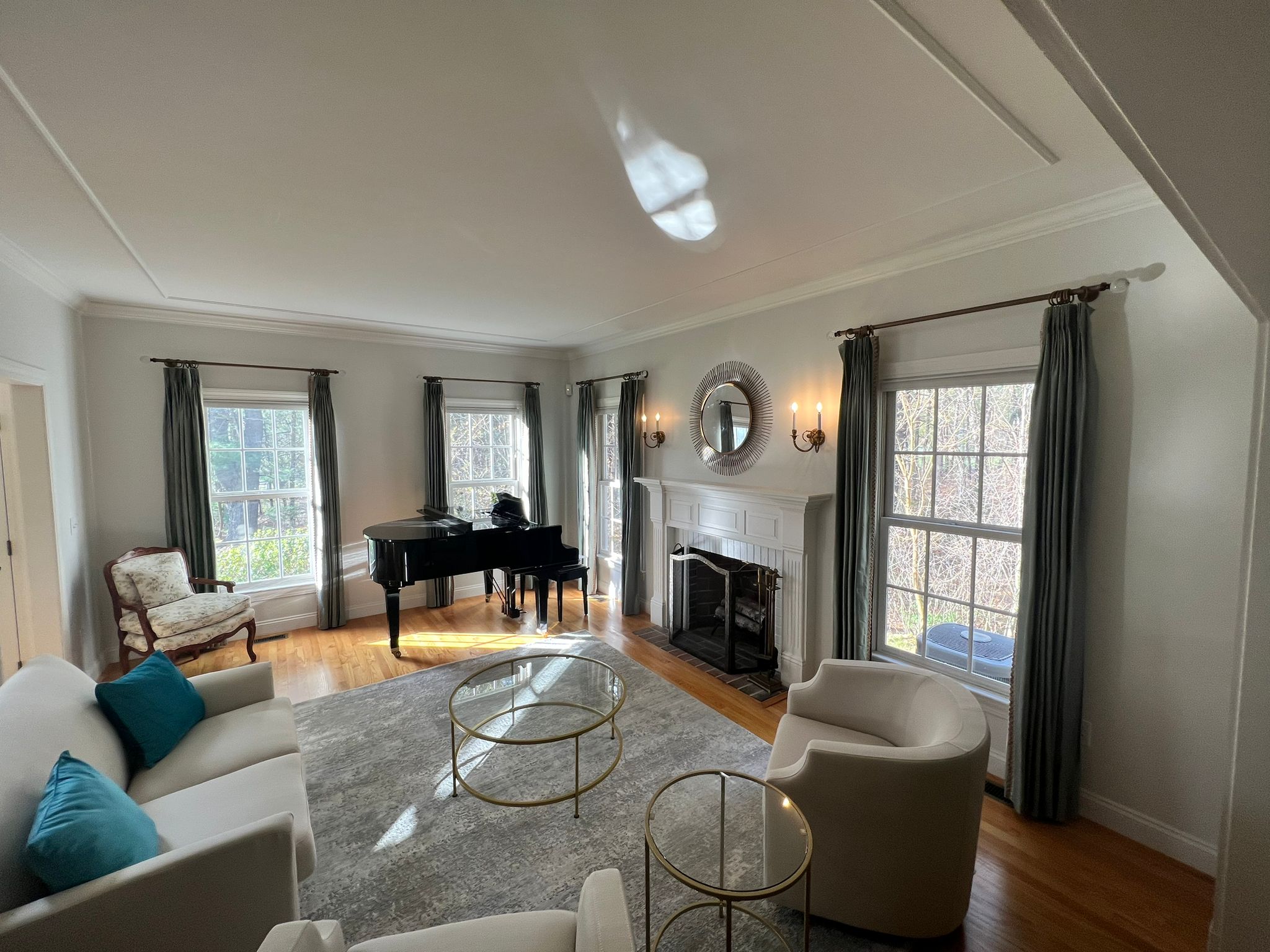
Light gray has become a cornerstone of modern interior design, offering a sophisticated and versatile neutral backdrop for countless homes. While "most popular" can be subjective and vary by region and design trend, certain shades have consistently risen to the top, earning widespread acclaim from designers and homeowners alike for their adaptability and timeless appeal. These colors strike a perfect balance, providing the crispness of gray without feeling cold, and the warmth of beige without being overtly yellow or cream.
Why light gray remains a top interior choice
The enduring popularity of light gray in interior design is no accident. It offers a unique combination of benefits that few other colors can match:
Unparalleled Versatility: Light gray serves as an exceptional neutral, effortlessly complementing a vast spectrum of design styles – from minimalist and modern to traditional and farmhouse. It allows furniture, artwork, and textiles to shine.
Expansive and Brightening: Lighter shades of gray reflect natural and artificial light effectively, making rooms feel larger, airier, and more open. This is particularly advantageous in smaller spaces, hallways, or rooms with limited natural illumination.
Sophistication and Calm: Gray inherently conveys a sense of calm, elegance, and maturity. Light grays create a serene and balanced atmosphere, conducive to relaxation and a refined aesthetic.
A Timeless Foundation: Unlike many trendy colors that eventually fade, light gray provides a classic, enduring foundation that remains stylish through changing fads, ensuring your interiors feel current for years to come.
Adaptable Undertones: The subtle undertones within light gray paints (blue, green, purple, or beige) allow them to be carefully selected to harmonize with existing fixed elements like flooring, cabinetry, and natural light exposure.
Best-selling light gray paints from top brands
While specific sales figures are proprietary, certain light gray shades are consistently recommended by interior designers and frequently appear in popular home decor publications and blogs. These are often lauded for their "perfect" balance and ability to adapt to various lighting conditions.
Benjamin Moore Classic Gray OC-23
Benjamin Moore Classic Gray is widely considered one of the most versatile and beloved light grays. It's often described as a soft, ethereal gray with barely-there green or sometimes violet undertones that shift beautifully throughout the day. What makes it so popular is its incredible ability to lean warm without becoming beige, making it suitable for both cool and warm palettes. It's a fantastic choice for open-concept homes where continuity is desired, creating a sophisticated and airy feel without being stark. It reads as a true "light gray" in many settings, avoiding the common pitfall of turning blue or purple.
Sherwin-Williams Repose Gray SW 7015
Sherwin-Williams Repose Gray is another perennial favorite that consistently tops popularity lists. This particular shade is a warm gray, often described as a "greige" because of its subtle brown or beige undertones. This warmth prevents it from feeling cold or sterile, making it highly inviting. Repose Gray works exceptionally well in rooms with a mix of warm and cool elements and is a go-to for many designers looking for a sophisticated, calming, and highly adaptable gray that pairs effortlessly with a wide range of other colors and materials, from dark woods to bright whites.
Behr Silver Drop N520-2
From Behr, Silver Drop is a highly popular and well-regarded light gray. It's a soft, delicate greige that offers a clean and fresh look without being overly cool. Silver Drop has just enough warmth to make a room feel cozy and welcoming, avoiding any starkness. It's a fantastic choice for creating a serene backdrop in bedrooms or for brightening up living spaces with abundant light. Homeowners often praise it for its ability to look consistently good in various lighting conditions, making it a reliable choice for those seeking a gentle, versatile light gray.
How to pick the perfect gray for your home
Choosing the "most popular" gray is a good starting point, but the perfect gray for your home will depend on its unique characteristics. Here's how to navigate the selection process:
Understand Undertones: Gray paints are complex. They almost always have subtle undertones of blue, green, purple, or beige. These undertones become more apparent when the paint is on the wall and interact with your home's natural light, artificial light, and existing decor. For example, a gray with a blue undertone might look icy in a north-facing room.
Consider Your Fixed Elements: Take stock of your home's permanent features, such as flooring, cabinetry, countertops, and even the color of your trim. Your chosen gray should harmonize with these elements, not clash. If you have warm-toned wood floors, a warm gray (greige) might be more suitable.
Assess Natural Light:
North-facing rooms get cooler, indirect light. Warm grays or greiges are often best to prevent the room from feeling too cold.
South-facing rooms receive bright, warm light throughout the day. Both warm and cool grays can work; cool grays can help balance the warmth.
East-facing rooms get warm, bright morning light and cooler light in the afternoon.
West-facing rooms receive intense, warm afternoon light.
Artificial Lighting Matters: The color temperature of your light bulbs (e.g., warm white, cool white, daylight) will significantly impact how a gray appears. Ensure you test your paint samples under the actual artificial lighting you use.
Define Your Desired Mood: Do you want a calm and serene space? A crisp and modern feel? Or something warm and inviting? Your chosen gray's undertones will greatly influence the overall mood of the room.
Tips for testing and sampling gray paints
Testing paint samples is non-negotiable, especially with gray, which is notoriously chameleon-like.
Buy Samples of Your Top Choices: Select 2-4 light gray contenders based on research and initial appeal. Many brands offer small sample pots.
Paint Large Swatches: Don't just dab a tiny spot. Paint large squares (at least 2×2 feet, or even larger) on at least two different walls in the room you're painting. This allows you to see the color on a significant surface and how it interacts with different light sources.
Observe Throughout the Day: View your painted swatches at different times of the day – morning, afternoon, and evening. Pay attention to how the color changes as the natural light shifts and as you turn on artificial lights.
Live with It for a Few Days: Don't make an immediate decision. Let the samples sit on your walls for a few days so you can get a true feel for them in your everyday environment.
Compare Against Fixed Elements: Hold samples of your flooring, fabric swatches, or cabinet doors up to the painted swatches to ensure they complement each other.
Consider a Second Coat for Swatches: Some colors require two coats for true depth and accuracy. If your sample pot is large enough, apply a second coat to a portion of your swatch.
Don't Judge on a Computer Screen: While online images can provide inspiration, monitor calibration varies wildly. Always rely on physical samples in your home.
Choosing the right light gray paint can transform your home into a stylish and comfortable sanctuary. By understanding the nuances of these popular shades and diligently testing them in your own space, you can confidently select a color that you'll love for years to come.
Ready to find your perfect gray? Head to your local paint store to pick up samples and begin your home's elegant transformation today!

About Masterpiece Painter
For over 17 years Masterpiece Painter, has been serving communities all around New England. Let us help you make your wishes come true by turning your property into a Masterpiece
Get a Quote
Contact Us


© copyright 2023 All Rights Reserved.