
Blogs
Two tone paint ideas bedroom
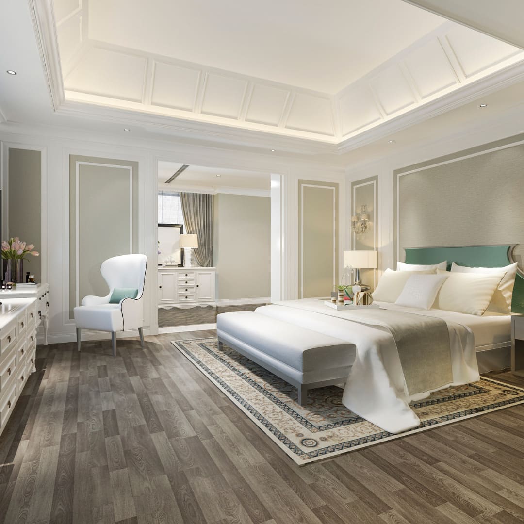
The bedroom is a sanctuary, and the way you apply color can drastically change its perceived temperature, size, and comfort level. Two-tone painting—the practice of using two distinct colors on the walls of a single room—has become a staple in American interior design for its ability to add architectural interest to even the most basic "box" rooms.
Quick Answer: Two-Tone Walls Create Visual Balance
Two-tone painting works by manipulating the visual weight of a room. By splitting the wall horizontally or creating a focal point with an accent, you can ground a room with high ceilings or add a sense of coziness to a large, sterile space. It allows for the use of bold colors that might be overwhelming if applied to all four walls, providing a balanced environment that promotes rest.
Why this trend works in bedrooms
Bedrooms often lack the architectural "bones" found in living rooms, such as fireplaces or large built-ins. Two-tone paint acts as a visual substitute for architecture. It can mimic the look of wainscoting, create a "faux" headboard behind the bed, or frame a window. Because the bedroom is a private space, it also offers more freedom to experiment with moodier, high-contrast palettes that might feel too daring for a communal living area.
Popular Two-Tone Bedroom Color Combinations
Selecting the right duo is more than just picking two favorite colors; it’s about how those colors interact with light and furniture.
Neutral top with darker bottom
This is the most traditional American two-tone approach. Typically, a crisp white or light cream is used on the top two-thirds of the wall, with a deep navy, charcoal, or forest green on the bottom third. This "grounds" the room, making it feel sturdy and classic, while the light top half keeps the space feeling airy.
Soft accent wall pairings
For a more modern, subtle look, many homeowners choose two shades from the same color family. For example, a soft lavender paired with a deep plum, or a light sage green next to a rich olive. This creates a monochromatic layered effect that is incredibly soothing—perfect for a sleep environment.
Warm vs. cool palettes
Warm Palettes: Using terracotta, sandy beiges, or muted corals can make a large, north-facing bedroom feel sun-drenched and cozy.
Cool Palettes: Blues, grays, and teals are scientifically proven to lower heart rates. Pairing a sky blue with a slate gray can create a sophisticated, spa-like atmosphere.
Design Tips for Two-Tone Bedroom Painting
Execution is everything when it comes to the "break" between colors.
Ceiling height considerations
If you have standard 8-foot ceilings, be careful not to "cut the room in half" exactly in the middle, as this can make the ceiling feel lower. Instead, follow the "Rule of Thirds." Place your color line at either the bottom 1/3 (traditional wainscoting height) or the top 1/3 (to make the room feel taller). For rooms with vaulted ceilings, you have more freedom to use dark colors higher up.
Where to place the color break
The Horizontal Split: Usually set at 36 to 42 inches from the floor. This is often capped with a piece of chair rail molding for a finished look.
The Vertical Split: Used for accent walls. The break should occur in the corners. If you are painting a "block" behind a bed, ensure it extends at least 6–10 inches beyond each side of the headboard for proper scale.
Professional Painting vs. DIY
While painting is a popular DIY project, two-tone designs require a higher level of precision.
Clean lines and symmetry
The biggest challenge in two-tone painting is achieving a perfectly straight line between colors. Professional painters use high-grade "Green" or "Yellow" painter's tape designed for delicate surfaces and often use a technique called "bleeding the base." They paint over the edge of the tape with the first color to seal it, ensuring that the second color cannot seep under. DIYers often struggle with "feathering" or "bleeding," which ruins the crisp aesthetic.
Long-term finish quality
A professional will ensure that both colors have the same sheen level. If you use a Matte for the top and a Semi-Gloss for the bottom, the light will hit them differently, which can make the wall look disjointed. Pros also ensure proper "flashing" prevention, so you don't see roller marks where the two colors meet.
FAQs
Do two-tone walls make rooms look bigger?
Yes, if done correctly. Using a darker color on the bottom and a very light color on the top (extending to the ceiling) draws the eye upward, creating the illusion of height. Conversely, a dark accent wall can add "depth," making a shallow room feel like it recedes further back.
What finish works best for bedrooms?
In American homes, Eggshell or Satin are the standard for bedroom walls. They have just enough shine to be wipeable but are matte enough to hide wall imperfections. Avoid High-Gloss on bedroom walls as it reflects too much light and can interfere with sleep quality.
Are two-tone bedrooms still in style?
Absolutely. While the "color-blocked" look of the early 2000s has faded, the modern two-tone approach—using muted earth tones and sophisticated "divided" walls—is a hallmark of contemporary "Transitional" and "Modern Farmhouse" styles.

About Masterpiece Painter
For over 17 years Masterpiece Painter, has been serving communities all around New England. Let us help you make your wishes come true by turning your property into a Masterpiece
Get a Quote
Contact Us


© copyright 2023 All Rights Reserved.