How to Choose Interior Paint Colors for Your Home?
Choosing the right interior paint colors can feel overwhelming, but it's one of the most impactful ways to personalize your living space. From creating a mood to reflecting your style, the colors you choose set the tone for your home. By considering a few key factors like a room's purpose, natural lighting, and the psychology of color, you can select a palette that feels just right.
Start with Room Purpose
The function of a room should be your first consideration. A color that works beautifully in a high-energy kitchen might not be the best fit for a serene bedroom.
Bedrooms vs living areas
Bedrooms are typically a place for rest and relaxation. Calming, muted colors like soft blues, gentle greens, and warm grays are ideal for promoting a peaceful atmosphere. In contrast, living rooms are often hubs of social activity. This is where you can be a bit more adventurous. You might choose warmer, more inviting colors like beige, cream, or a soft gray to create a welcoming space, or use a bold accent color to reflect your personality.
Kitchens and bathrooms
Kitchens and bathrooms are often high-traffic, functional spaces. Bright, clean colors like white, light gray, or a cheerful yellow can make a kitchen feel spacious and hygienic. In bathrooms, a cool, refreshing color like a pale aqua or a crisp white can create a spa-like feel. Durability is also a key concern here, so opting for a paint with a satin or semi-gloss finish is a smart choice to handle moisture and frequent cleaning.
Consider Natural Lighting
The amount of natural light a room receives drastically affects how a color looks on the walls. A color swatch you love in a store might look completely different in your home.
South-facing vs north-facing rooms
Rooms that face south get a lot of bright, warm light throughout the day. Almost any color will look good in a south-facing room, but cool colors like blues and grays can help balance the strong sunlight. North-facing rooms receive less direct light, so colors can appear darker and cooler. To avoid a gloomy feel, choose warm colors with red or yellow undertones, such as beige or cream, to make the room feel cozier.
Artificial lighting impact
Don't forget to consider how your artificial lighting will affect the paint color. Light bulbs with a warmer, yellow-toned glow will make cool colors look muted, while a cooler, bluish light will bring out cool tones and make warm colors appear dull.
Color Psychology in Interiors
Colors have a powerful effect on our mood and can influence the atmosphere of a room. Understanding color psychology can help you choose a palette that supports the feeling you want to create.
Calming blues and greens
Blues and greens are known for their calming effects. Blue is often associated with the sky and sea, promoting a sense of peace and stability. Green connects us to nature and can evoke feelings of harmony and freshness. These are great choices for bedrooms, home offices, and bathrooms.
Energizing yellows and reds
Warm colors like yellows and reds are often associated with energy and warmth. A bright yellow can make a space feel cheerful and optimistic, while a touch of red can add a sense of excitement and passion. These colors work well in spaces where you want to feel energized, such as an entryway, a dining room, or a kitchen.
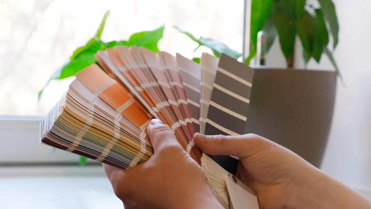
Tips for Testing Paint Colors
You should never choose a paint color without testing it in your home first. This crucial step can save you from a costly mistake.
Sample swatches on walls
Buy small sample cans and paint large swatches (at least two feet by two feet) on a couple of different walls in the room. This allows you to see how the color interacts with your room's unique lighting and furnishings.
Observe colors at different times of day
The color will change throughout the day, so check your swatches in the morning, afternoon, and evening to see how they look in different lights. You'll be surprised by how much they can vary.
FAQs
Should all rooms be the same color?
No, all rooms do not need to be the same color. A consistent color palette that flows from room to room can create a cohesive feel, but using different colors to define spaces and create distinct moods is an excellent design strategy.
How many colors are too many in one home?
There's no hard and fast rule, but a good guideline is to stick to a main color palette of three to five colors that you use consistently throughout the home. You can vary the shades and add a few accent colors for interest, but a core palette helps maintain a sense of harmony and flow.
Ready to start your painting project? Contact us today for a free estimate and professional guidance on choosing the perfect colors for your home.
