Repainting Kitchen Cabinets the Same Color as Walls: Is It a Good Idea?
Moving away from the traditional high-contrast kitchen (e.g., white walls with dark cabinets or vice-versa), modern design trends heavily favor monochromatic looks. Painting your cabinets and walls the exact same shade creates a powerful sense of cohesion, blurring the lines between structural elements and joinery. However, executing this look successfully requires strategic choices regarding texture and finish.
The Trend Toward Monochromatic Kitchens
This design choice is gaining momentum across the US, favored by architects and interior designers for its elegant simplicity and ability to manipulate perception of space.
Creates a Seamless and Modern Aesthetic
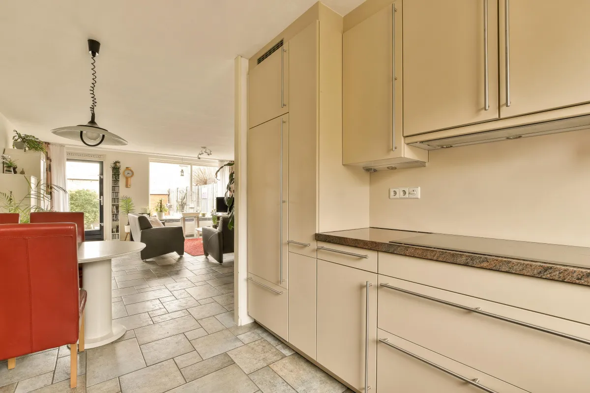
When walls and cabinetry are the same color, the kitchen feels less fragmented. The cabinets, rather than shouting for attention, blend into the background, giving the space the feel of expensive, custom-built millwork.
Architectural Flow: This technique forces the eye to travel across surfaces without interruption, highlighting the kitchen's architecture and any unique design details (like specific appliance placement or ceiling height).
High-End Feel: It mimics the look of high-end European kitchens where the joinery is often flush and designed to disappear, making the room feel tailored and meticulously designed.
Works Well with Minimalist and Small Spaces
The monochromatic approach is a strategic tool for managing visual clutter and maximizing the feeling of openness, making it ideal for compact kitchens or open-concept living areas.
Illusion of Space: When boundaries are blurred, the room’s perceived size expands. In a small kitchen, matching the wall and cabinet color prevents the cabinets from creating sharp visual blocks that close in the space.
Minimalist Base: It provides a calming, neutral foundation that lets hardware, lighting, and countertop materials become the focal points without competition from contrasting color blocks.
Pros and Cons of Matching Cabinets and Walls
Like any major design choice, achieving a unified kitchen comes with distinct advantages and pitfalls that must be considered during the planning phase.
Pros – Clean, Unified Appearance
Cohesion and Tranquility: The unified color palate instantly creates a calming and non-jarring atmosphere, ideal for kitchens that open directly into living or dining areas.
Timelessness: While specific color trends change, the concept of a unified, singular color is highly classic and less likely to look dated quickly than stark, high-contrast combinations.
Highlighting Materials: It allows expensive materials like marble countertops, brass hardware, or intricate tile backsplashes to truly shine as the primary texture and color highlights.
Cons – Risk of Visual Flatness
Loss of Definition: If not properly executed, painting everything the exact same color and sheen can make the kitchen look dull, two-dimensional, or simply unfinished.
Shadow Management: The lack of contrast means that any dust, streaks, or imperfections will be amplified if the lighting is poor. Every surface must be meticulously finished.
How to Make It Work
The secret to a successful monochromatic kitchen is creating visual contrast using elements other than color. This is where professional design techniques truly pay off.
Add Texture with Backsplash or Lighting
Since the color is the same, texture and reflection become the primary tools for adding depth and interest.
Textural Backsplash: Introduce a material with natural variation or a strong pattern. Examples include Zellige tile (handmade with subtle surface imperfections), natural stone (like quartz with veining), or shiplap paneling. This breaks up the flat paint without introducing a new color.
Strategic Lighting: Install under-cabinet LED strips and use pendant lighting over islands. This creates necessary shadows and highlights, making the texture of the cabinet fronts (even simple Shaker profiles) visible and providing definition.
Use Sheen Contrast (Matte vs. Satin) for Depth
This is the single most critical trick professional painters use to create definition in a unified color scheme.
Cabinets (Satin or Semi-Gloss): Cabinetry must be painted in a durable, easy-to-clean finish. Satin or Semi-Gloss is ideal. These sheens have a higher resin content, cure harder, and, most importantly, reflect light.
Walls (Matte or Eggshell): Walls should be painted in a much flatter sheen—Matte or Eggshell.
The Effect: When light hits the kitchen, the high-sheen cabinets will reflect light dramatically, appearing slightly lighter and brighter than the surrounding flat-sheen walls, even though they are the exact same color. This subtle difference is enough to define the cabinetry edges beautifully.
Best Color Palettes for a Unified Kitchen
While technically any color can be used, the most successful monochromatic kitchens rely on sophisticated, subtle hues that are easy to live with long-term.
Warm Whites, Soft Greys, or Muted Greens
Warm Whites (Creamy Off-Whites): The most popular choice. Whites with a touch of beige or yellow pigment prevent the room from feeling stark or sterile. This approach provides a gallery-like backdrop.
Soft Greys (Greige or Taupe): These muted neutrals offer more visual weight than white but still feel airy. Greys with brown undertones (greige) are especially successful, as they pair well with natural wood accents and brass hardware.
Muted Greens (Sage or Olive): For a bolder, yet still sophisticated look, soft greens are excellent. They bring a natural, earthy element into the space and pair beautifully with metal finishes.
Bold Contrast (Black or Navy): Using a deep color like matte black or navy blue creates a highly dramatic, enveloping space, which works best in rooms with abundant natural light to prevent it from feeling too dark.
FAQs
Should trim match the wall and cabinets too?
For a truly modern, unified, and seamless look, yes, the trim (baseboards, door casings, and window trim) should match the wall color.
However, use the wall's sheen (Matte or Eggshell) for the trim, not the cabinet's higher sheen. Painting the trim the same flat finish as the wall helps the transition from floor to wall to cabinet feel clean and continuous, reinforcing the monochromatic design intention.
What finishes work best for this style?
The rule of thumb for durability and visual interest in a monochromatic kitchen is: Sheen Contrast.
For the Cabinets: A high-durability enamel in Satin or Semi-Gloss (essential for longevity and easy wiping).
For the Walls: A high-quality interior latex paint in Eggshell or Matte (to absorb light and create a visual distinction from the cabinets).
By meticulously controlling the sheen, you ensure your kitchen maintains depth and avoids visual "flatness" while still achieving the desirable unified color effect.
The success of a monochromatic kitchen rests entirely on meticulous preparation and the use of the correct, durable enamel on the cabinetry. It requires precision painting, especially around the masked edges of the trim and glass.
Ready to achieve this high-end, unified look in your home? Contact Masterpiece Painter today for a detailed consultation on sheen selection and color matching to ensure your new kitchen design stands the test of time!
