Two tone exterior house paint ideas
In the landscape of American residential architecture, the "monochromatic" look is being replaced by sophisticated multi-dimensional palettes. A two-tone exterior strategy allows homeowners to highlight the unique lines of their property while increasing curb appeal through intentional contrast.
Quick Answer: Two-Tone Exteriors Add Depth and Definition
Using two primary colors on a home’s exterior serves to "ground" the structure. By separating the body of the house from the trim, gables, or lower levels with a secondary hue, you create visual weight and architectural interest that a single color simply cannot provide. This technique is particularly effective for modernizing older homes or making new builds stand out in competitive real estate markets.
Why modern homes use layered colors
Modern design relies on the interplay of shadow and light. Layered colors—such as a charcoal siding paired with a light dove-gray trim—simulate natural depth. This "framing" effect directs the eye to specific areas, like a grand entryway or a unique roofline, making the home appear more structured and custom-designed.
Popular Modern Two-Tone Exterior Combinations
Selecting the right pair of colors requires an understanding of contrast and color temperature. Here are the most prevalent combinations currently trending in the U.S.
Light body with dark trim
This is the "modern farmhouse" or "contemporary classic" look. A crisp white or off-white body paired with black, navy, or dark bronze trim creates a high-contrast, clean aesthetic. It outlines the home’s silhouette and makes windows appear more prominent.
Neutral base with bold accents
For those who prefer a more subtle approach, using a neutral base (like greige or tan) with a bold accent color on the gables or the front door is highly effective. This allows for a pop of personality—such as a deep forest green or a muted terracotta—without overwhelming the neighborhood's visual harmony.
Where to Apply Each Color
The success of a two-tone project depends on where you "break" the colors.
Siding vs trim
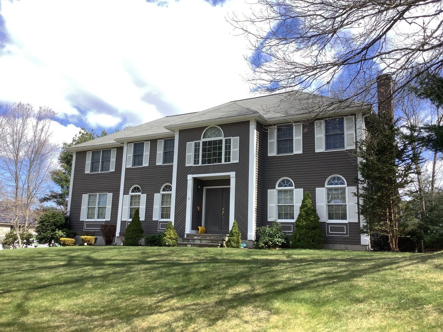
The most common application is using the lighter color on the main siding (the "body") and the darker color on the trim (fascia, soffits, window frames, and corner boards). However, the "inverted" look—dark siding with light trim—is gaining massive popularity in modern suburbs for its moody, high-end feel.
Architectural features
If your home has varied textures, such as a mix of horizontal lap siding and vertical board-and-batten, these are the natural transition points for your two colors. Use the secondary color to highlight:
Gables: The triangular upper part of a wall at the end of a ridged roof.
Columns: Porch pillars or structural supports.
Secondary Levels: Painting the second story a slightly different shade than the first.
Professional Exterior Painting Benefits
While DIY is possible, exterior painting in the U.S. involves specific environmental challenges that professionals are equipped to handle.
Weather durability
A professional crew understands the local climate variables. They use high-quality acrylic latex paints that expand and contract with temperature changes, preventing the cracking and peeling common in extreme seasons. This is vital for maintaining the sharp line between your two chosen tones.
Proper surface prep
The secret to a long-lasting two-tone finish is preparation. This includes power washing, scraping old lead-based paint (in older homes), priming raw wood, and caulking gaps. Without professional-grade prep, the darker "accent" colors will often show sun-fade or moisture damage much faster.
FAQs
Do two-tone exteriors increase home value?
Yes. Real estate experts generally agree that a well-executed two-tone palette increases "curb appeal," which is the first impression a buyer receives. It suggests the home has been updated and maintained with modern design sensibilities.
Are two-tone homes harder to repaint?
Technically, yes. It requires more careful masking (taping) and more equipment, as you are switching between two different paint cans and sets of brushes/rollers. However, the visual payoff is widely considered worth the extra labor.
What colors work best in New England?
In New England, the palette is often influenced by the coast and historic colonial architecture. Deep Navy with Crisp White or Slate Gray with Natural Cedar accents are classic choices. Because of the long, gray winters, many New Englanders opt for "warm" neutrals or historical "heritage" colors like sage green and barn red to provide warmth against the snow.
